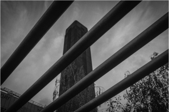
Depth & Diagonals
When a photo is viewed on a screen of in print it is flat and two dimensional. To overcome this try to give your photos a sense of depth by including foreground, middle ground and background, like this:

The photo above has a foreground (the melons), a mid ground (the man and the fruit) and a background (the window). This makes us feel like we are looking into the scene and we feel it is more three dimensional.
Here is another example:

Using foreground, middle ground and background works well in landscape photography, and you can also apply it to nature, wildlife and portraits if you take some time to consider how you will compose the photo.
Another thing to try is to incorporate diagonal lines in your photo. Diagonals look more interesting than vertical or horizontal lines. They divide up frame and give the viewer different angles to look at. This makes them more interesting to look at. Try to incorporate them when you can, like this:

